COLOR CONSULTATION
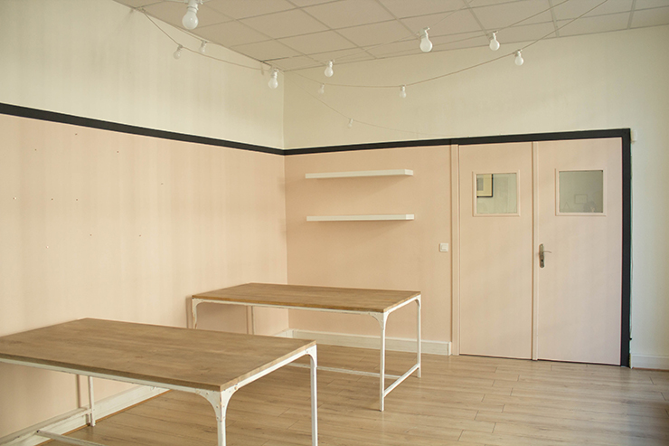
Color Farrow and Ball Pink Ground N°202 / Wimborne White N°239 / Off Black N°57tables Maisons du monde and garland found on Lightonline.fr .
Hello kittens,
I'm back to you this week with the first installment of our offices, well there won't be 12 episodes like a StarsWar SAGA but just two, but it's important that we explain the process to you... So as I was telling you, we've reclaimed a whole room from our flat-share, and yes, just imagine that a little over a year ago there were 10 of us right here... And not just 10 behind screens, but chopping wood, sewing and cutting mountains of reams of paper... Hiroshima 1945, every day of the week.
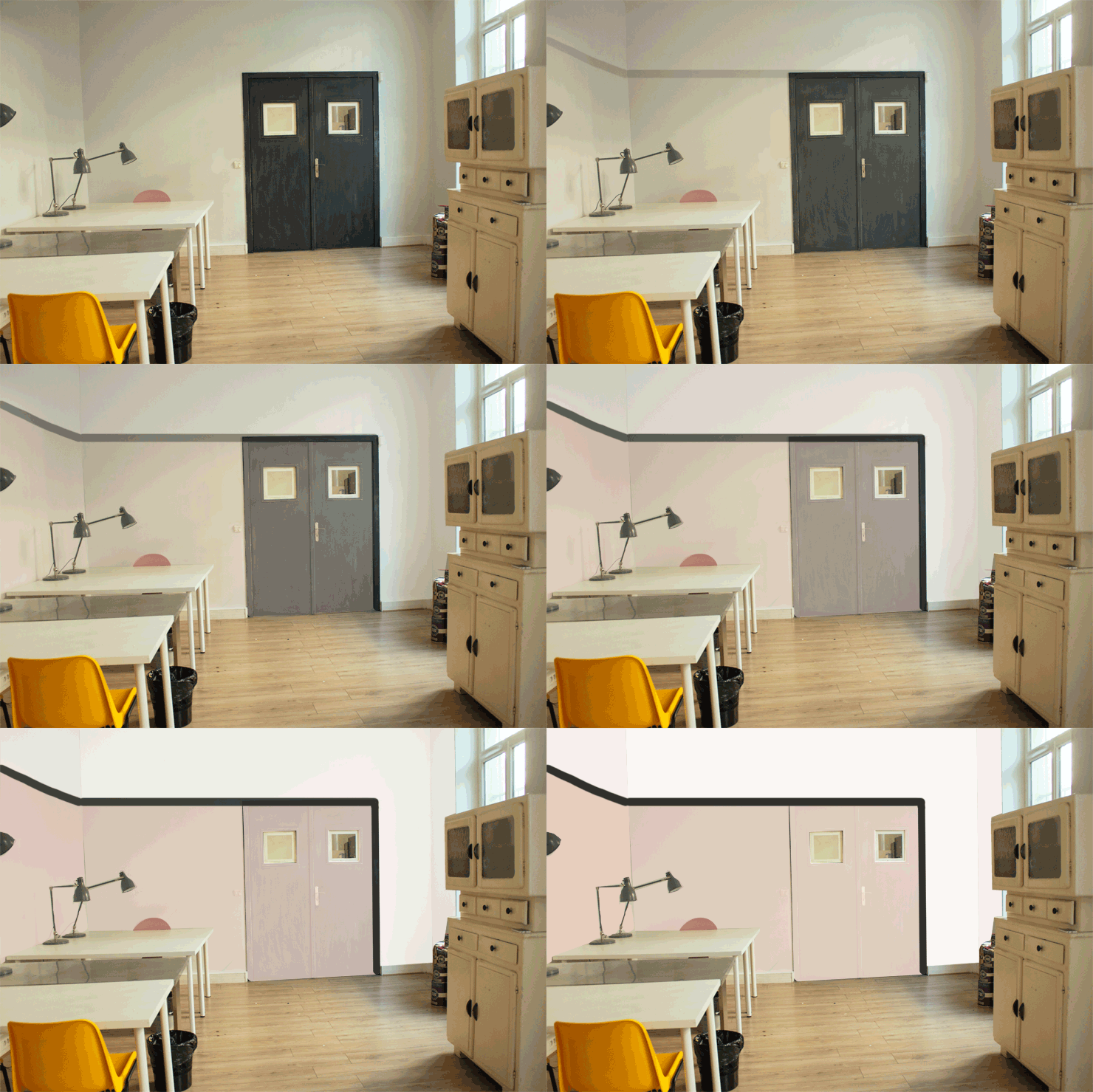
Pink Ground N°202 / Wimborne White N°239 / Off Black N°57
The walls were painted blue/grey/ugly, the uprights and doors in weird thunder grey, but it was a temporary situation until I could find something better, and it was a good thing to have an office away from home, anywhere, as long as I could get out of my flat, wear real clothes and stop jogging until 6pm... So it was temporary, but in the end it lasted 9 long months of blue/grey/ugly and unpacked boxes... So today, I'm going to tell you how to "transform" an office hallway, into a cosy workspace with just the help of a little color... For the furniture, we'll see tomorrow.
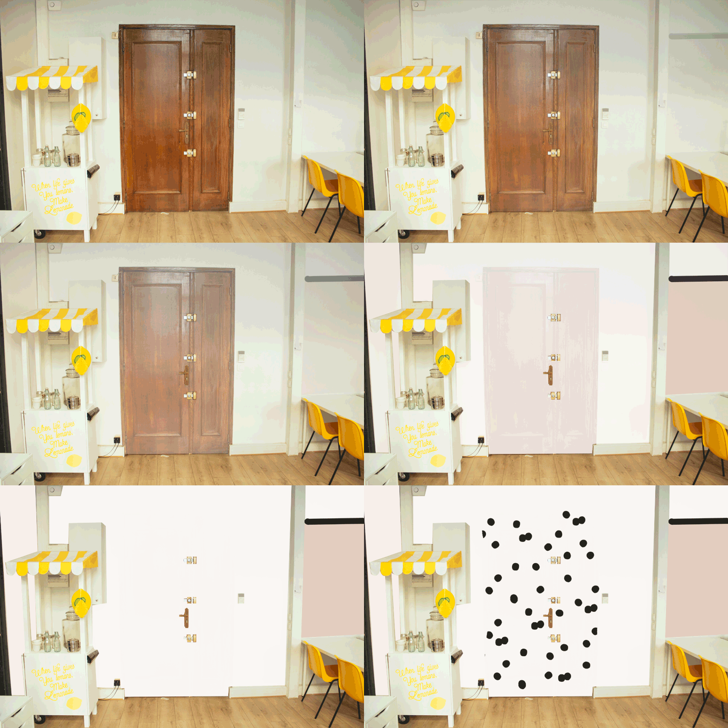
For the office renovation, I was lucky enough to collaborate with the famous paint brand Farrow and BallI had a real "color consultation", a bit like going to the doctor because my workspace was in pain. I had color desires, a wall like this, a sub-basement like this, and only one inspirational image this one. But, naive as I was, I had absolutely no idea that color could delimit space and organize a room. So one day, color specialist Geoffrey from the Farrow and Ball boutique in Le Marais came into the office and listened to me. I felt like I was lying on a couch, telling him about my decorating anxieties, my "pinterestable" desires, my passion for lemonade and my addiction to polka dots. Geoffrey literally surveyed the room, and said, "There's work to be done". No kidding?
And then he got out his color chart, showed me shades of pink, white and black, and like a bit of a magician, composed the room's organization. Granted, it takes imagination and a certain talent to project, but I knew he understood what this office needed, and what we wanted it to be.
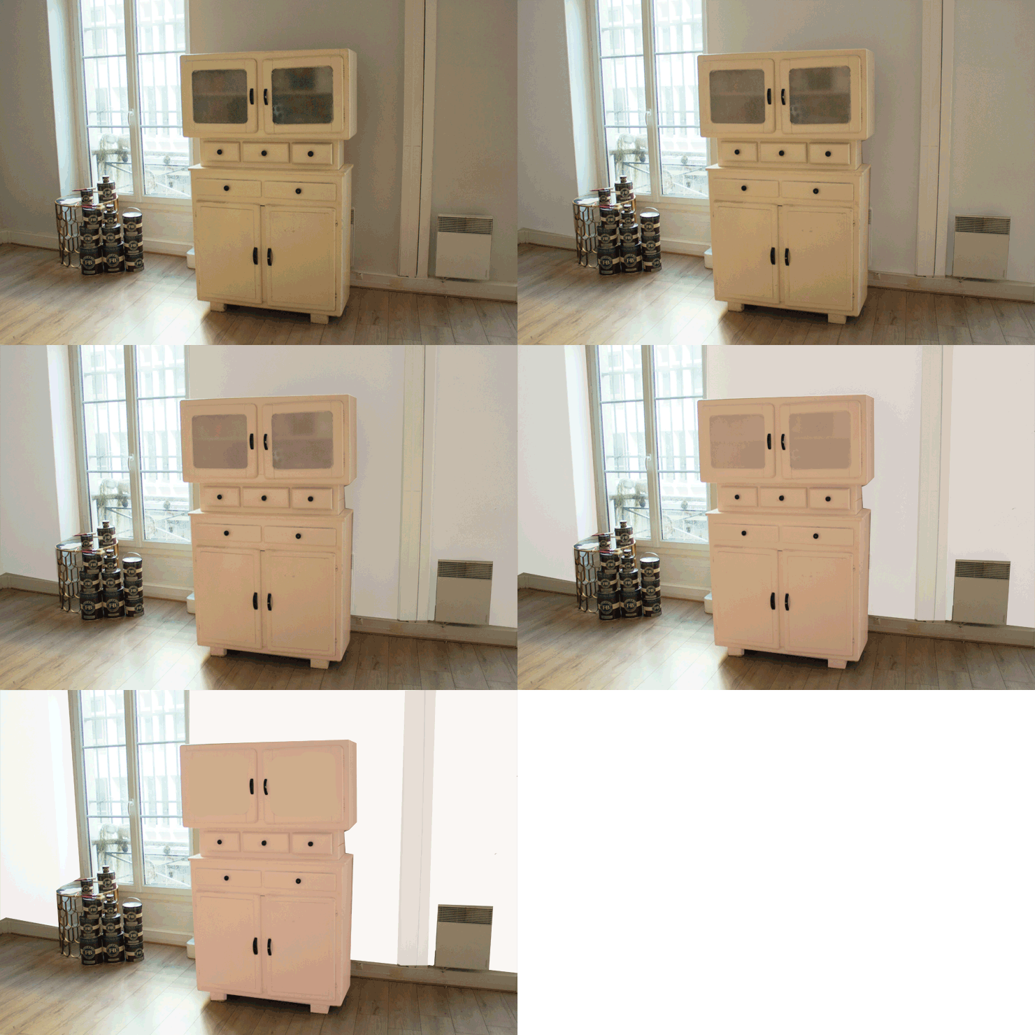
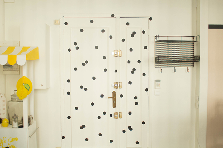
As you can see, all the doors in the office were dark or stained brown, and this emphasized the fact that we were standing in the entrance to another space. As we entered the office, we were automatically guided by the "flashing" double black door, so this way, folks. So we "erased" all the doors by painting them the same color as the walls. And we delineated the workspace with a large pink solid and a small black border. The pink solid color draws an "L" in the room, and the black border starts at the bottom of the door jamb and continues around it, to delimit the "work" space.
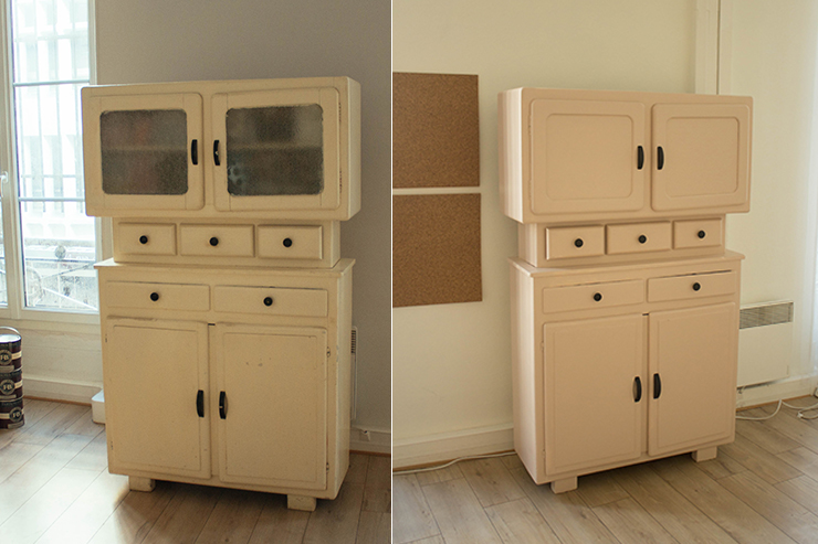
And you're going to say to me, there's still this polystyrene slab ceiling, I'm looking for the adjective to define this ceiling. I think I'm risking being vulgar, but you know what I mean... Well, there aren't 36 solutions, because it's a fireproof ceiling etc. But to limit the visual aggression of the neon lights and imitation granite tiles, we opted for two solutions: The first was to never turn on the neon lights again, and ignore the switches. And more seriously, to create a distraction, I wanted to put up a garland of light bulbs, in a "guingette" atmosphere. I found garlands with sockets and cables at Lightonline.frbut I'll show them to you better tomorrow. It's a solution for diverting attention from the ceiling. And it makes for very soft lighting, absolutely insufficient for working, but you'll see our other indirect lighting solutions tomorrow.
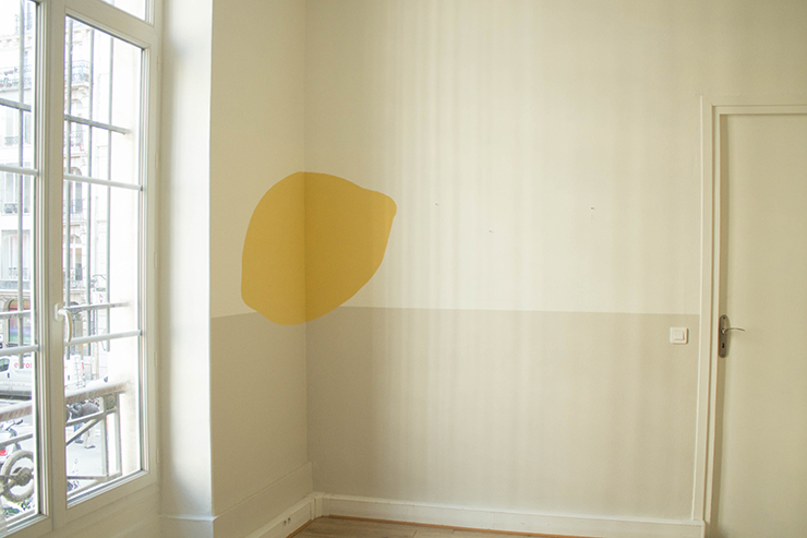
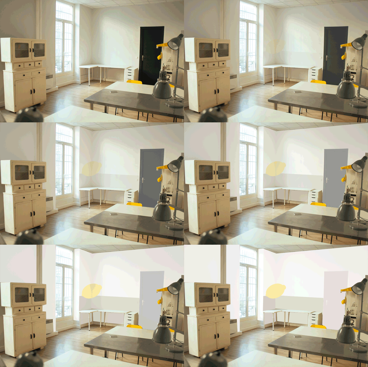
Skimming Stone N°241 / Wimborne White N°239 and lemon Yellow Ground N°218
And for our "rendezvous / lounge / waiting room / lunch between us" corner, Geoffrey suggested we start with a beige Skimming Stone N°241 L-shaped base and do an "anamorphosis" of lemon in the corner. Yeah Yeah, so to make an anamorphosis, it's the beautiful Alexandra B. who came with her overhead projector and projected the image of a lemon in the corner of the room. She drew the outline and we painted it as a lemon in Yellow Ground N°218!
I'm so excited to show you the rest! See you tomorrow for the second part of the decorating!


